By Ted Simonds, Project Cataloguer (Sion College Library) and Camille Koutoulakis, Digital Officer
As we approach the 400th anniversary of Sion College in 2030, and with the work to catalogue, conserve, share and study the collection ever increasing, we decided to digitise Sion L40.2/E64, the Sion College Library Book of Benefactors.
Sion College was founded as an institution for the benefit of the London clergy on the death of Reverend Thomas White in 1624. From the late 1620s, White’s executor John Simpson established a library and began receiving gifts of books and money to buy books. Sion College received its royal charter in 1630 and went on to become a significant library in London in the 17th century, actively acquiring books right through to the late 20th century. The manuscripts and early printed materials (pre-1850) are now housed at Lambeth Palace Library.

The collection of manuscripts in Sion College Library date from the early 11th century, while the oldest printed book is from 1473. The Library contains material in a range of languages and scripts and relating not only to the study of religion, but areas such as travel, history, literature, law and bibliography. The range of books is met only by the range of people who donated to Sion College. A remarkably forward-thinking institution from the outset, Sion College kept a record of its benefactors from 1629 right through to 1982.
In the Book of Benefactors, Sion College recorded not only the names of their donors, but what they gave. When they gave books, they list the books. When donors gave money, Sion College list what books were bought with that money. This record is a rich trove not only of when books entered Sion College Library, but what books were owned by people and what books were sought out by Sion College. The types of questions you can ask of this resource are many and various.
Former Librarian of Lambeth Palace Library, Richard Palmer, catalogued this manuscript on CALM (the searchable archives catalogue of Lambeth Palace Library) in 2014, and very usefully included in the record a transcription of the names and occupations of the various donors and what page they appear on. This has proved a very useful resource for librarians and researchers studying the provenance of books in Sion College Library.
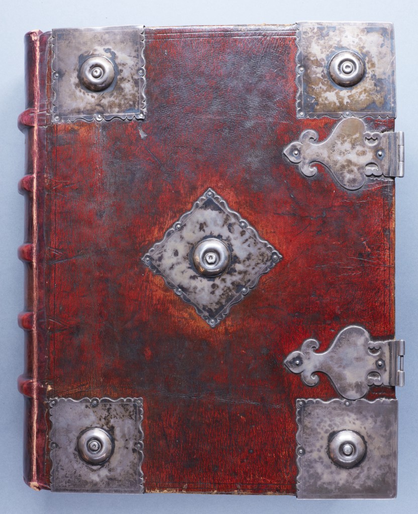
The book itself is huge, bound in red goat skin, with huge silver bosses. There is a record from 1629 that says that John Simpson (Thomas White’s executor) ‘gave […] a fair vellome booke clasped & bossed with silver to the value of twenty pounds, carefully preserved within this desk, wherein the names of benefactors together with the sums of money as also the bookes bought there with are gratefully recorded to posterity’.
The binding has survived nearly 400 years. The only serious damage is that the clasps (originally also silver) were plundered by Cromwell’s troops when they were billeted in Sion College in the Commonwealth Period. How long ‘posterity’ was thought to be by Sion’s founders is reflected in the number of pages they chose to include in the Book of Benefactors. Of the 502 pages, 430 are filled with bequests and donations, with the remaining 72 pages blank. Sion planned for their future and thought it important to record the generosity of their donors. Sion’s founders must have imagined this register would have been added to hundreds of years in the future. Digitisation prevents the need to consult the book every time you want to search for a donor, whether during the routine cataloguing of the collection, for enquiries, or for public research.
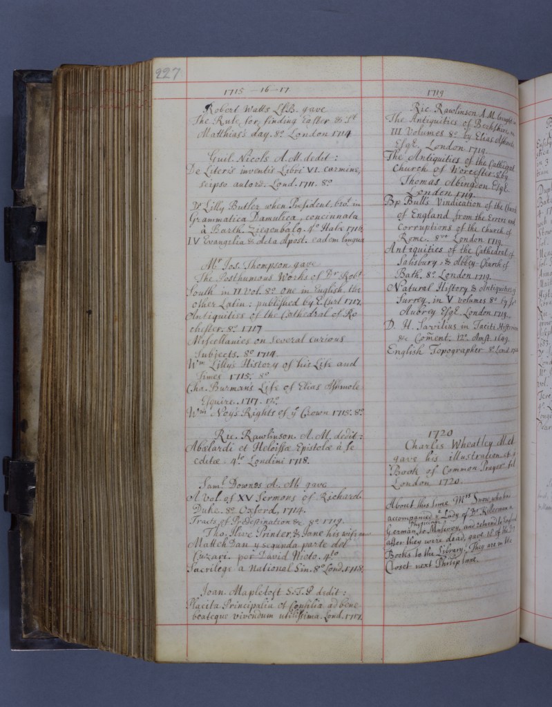
Each page has been photographed, and the corresponding page entry from CALM has been retained and included to enable searching by name and year (and even occupation where listed). A search for a name in LUNA will now show you the page where this name appears, allowing for users to see the details of the bequest (which were not transcribed on CALM before).
Researchers now have full access to the manuscript, revolutionising the way we interact with the provenance and collection history of Sion College Library, deepening our knowledge of the collection and preserving it for posterity. Associating the metadata from the catalogue record with the images of the pages opens up areas of research hinted at above: who gave what, and when? What books were sought after by Sion College Library? How did people style themselves within this record, and what does an anonymous donation look like? Who keeps coming back to give books? What relations exist between donors, the London clergy, citizenry, and the wider world? How do donation patterns change over nearly half a millennium? What kinds of people are represented in the Book of Benefactors and who is left out?
