By Grace Howson, Collection Care Assistant
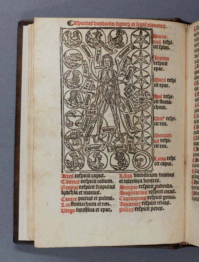
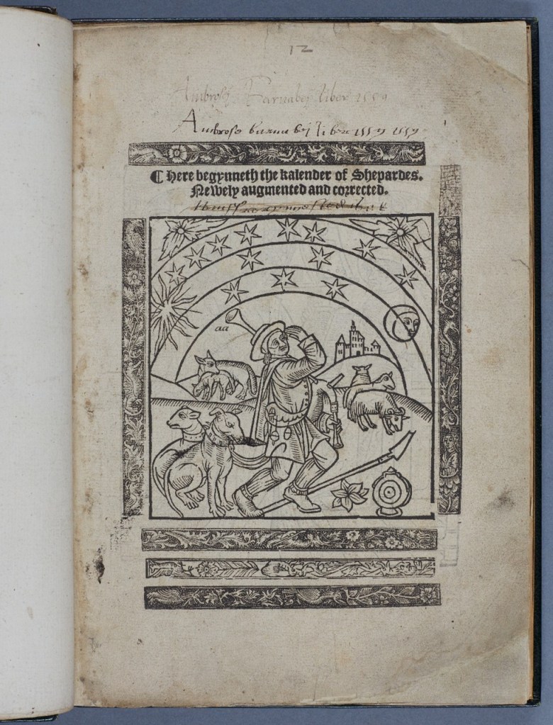
As part of the Unfolding Time exhibition, display cases in the mezzanine of Lambeth Palace Library offer insights into the different book forms and materials used during the medieval period, giving additional context to the exhibition’s focus on the concertina fold almanac. As part of this, the opportunity to include a woodblock and subsequent print was discussed, and whether a unique design for the exhibition could be created. Having some experience working with wooden objects and carving, I was asked to develop a design, carve the block and make a subsequent print so each of the stages of printing could be featured. Sarah Griffin, the curator of Unfolding Time provided image references as a starting point. These included a representation of the Zodiac man from a Book of Hours printed by Wynkyn de Worde [ZZ]1526.2, and the Shepherd and Zodiac Man from the Shepherd’s Kalendar [ZZ]1556.07, featured on the exhibition poster.
Parameters
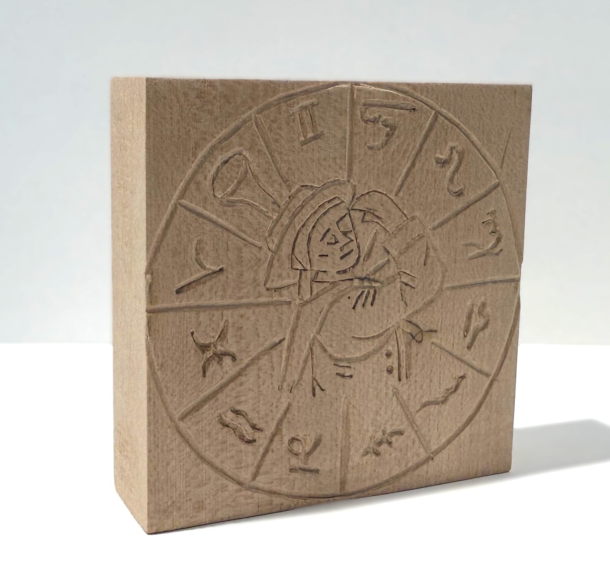
To ensure a successful outcome, Sarah was advised on sizing, wood type, and legible design options. From these a block of lime wood chosen for its carvability and measuring 114mm x 114mm was selected. As part of the discussion the choice of print colour was considered. For readability and to make a clear link to printed books and documents of old, a simple carbon black was chosen. The final choice of paper would be dependent on how the image transferred when printing.
Design
Once the parameters were established, several designs were presented to Sarah. Based on the sizing of the woodblock, two of the zodiac man images were dismissed as the level of detail needed to make the design legible would have been greatly reduced. Instead, the idea of using the zodiac symbols, emblems or initials alongside the Shepherd from the Shepherd’s Kalendar appeared a more achievable and legible outcome.
The four potential design choices are shown below. The use of a circle/wheel was featured in most of the designs as a means of showing the zodiac constellations inspired by Battista Agnese’s sixteenth-century Atlas (MS 463), featured in the exhibition, and as a representation of a clock face alluding to the passage of time. Sarah made the final choice of Image Two with some discussion on what aspect would be the relief with the design transferred onto the block using carbon paper.

Carving
I used a variety of tools to achieve the desired outcome as shown in the images below. These were a collection of sharpening stones, chisels (gouge, straight, convex), wooden mallet and sandpaper. The greatest portion of time was dedicated to sharpening the chisels. This was integral to ensure a smooth cut in the wood and avoid the blade skipping across the surface causing blemishes in the final design.
The wood has been stored in various conditions over several years, and this, in combination with the conditions of the studio space led to physical changes in the block. As wood is a hygroscopic and anisotropic material it reacts to humidity and moisture in the air and can cause deformation with some sections being more friable (more likely to break away) than others. This meant carving in some directions could not produce a smooth line so regular adjustments in position were crucial at these points.
The carving itself was worked on over the equivalent period of three days.

Printing
The printing ink chosen was an oil-based but water-soluble option. This meant that in opposition to a fully water-based paint, the ink would not dry as quickly, allowing for greater useability, but also made sure that the tools would be more easily washable than if it was solely oil-based where chemicals would need to be used.
When making the print, a variety of paper options were gathered to see a range of outcomes based on the paper’s texture/smoothness and thickness. I found that the smoother the paper, the clearer the outcome resulting in a crisper image and better transfer of ink. However, this also had the downside that the smoothest of the papers – newspaper print, was also likely to degrade at a faster rate, and potentially be affected by the light levels on the mezzanine, which only hold facsimiles for this reason.


Overall, the design, carving and printing of the wood block was a success and fit well within the story of the exhibition. It also shows the range of items that can be used in a library exhibition and helps to bring the process of printing to audiences in a clear, visual manner.
The exhibition Unfolding Time: The Medieval Pocket Calendar, including the completed woodblock and print, is open until 15th May at Lambeth Palace Library.
